Employing Design Leadership as an Agent of Change
Summary
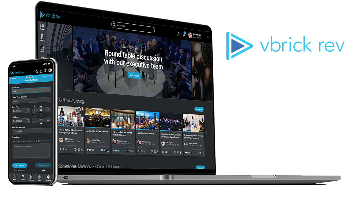
A live streaming and enterprise video platform (EVP) used by some of the largest companies in the country, including Ford, Walt Disney, Visa, Pfizer, Morgan Stanley, and more. The Rev platform allows for global large-scale live events with tens of thousands of simultaneous participants, robust integrations, and cutting-edge VOD enrichment features.
Problem Statement
Rev is one of the more powerful live streaming / EVPs in the market today, but with a heavy investment in architecture, integrations, and features, the user experience has often been ignored. Increased competetion over the last couple of years from startups and blue chips alike have generated internal intest in revisiting the UI and UX of our platform, but with no clear vision and the lack of a champion, the effort never materialized. I was tasked with realizing the vision for the next generation of the platform (which we'll call Rev 2.0), generating internal support for the project, leading discussions on how to implement the redesign, and validating our decisions with both our internal stakeholders and our clients.
Project Goals
- Identify major pain points on our platform through a combination of heuristic evaluations, affinity mapping, and user testing.
- Develop a functional prototype for Rev 2.0 that could be used to showcase preliminary design ideas and generate internal support.
- Land the project on the 2021 project roadmap with both firmwide support and resouce commitments.
- Gather feedback from internal stakeholders and power users, then test and validate our decisions prior to development.
Project Duration
My Role
The Team
My Contributions
Software Used
In my initial review of the platform, one pattern repeatedly stuck out — a lack of consistency. It appeared as though certain sections of the platform were designed at different times, and by different designers, engineers, and product managers. That turned out to be the case. To understand where opportunities for improvement lied, I turned to a couple of methods to help uncover the most glaring pain points and areas of inefficiencies.
Existing Screens
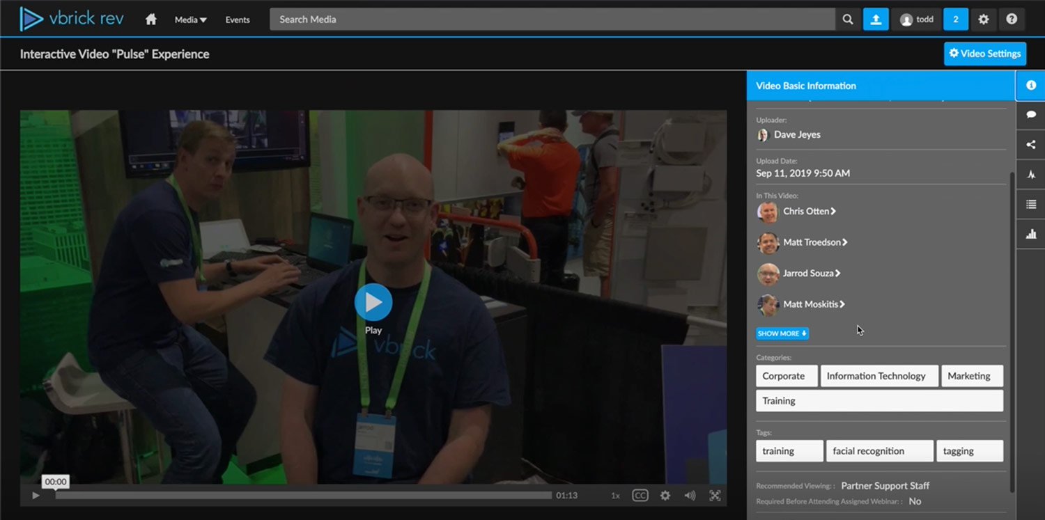
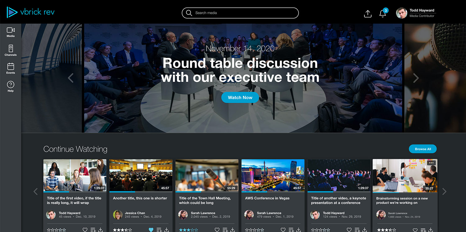
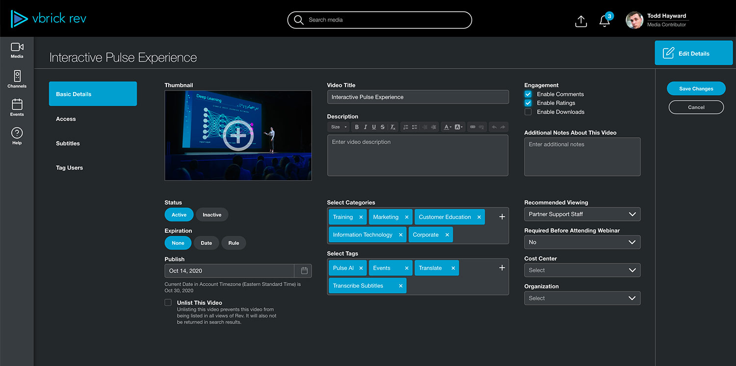
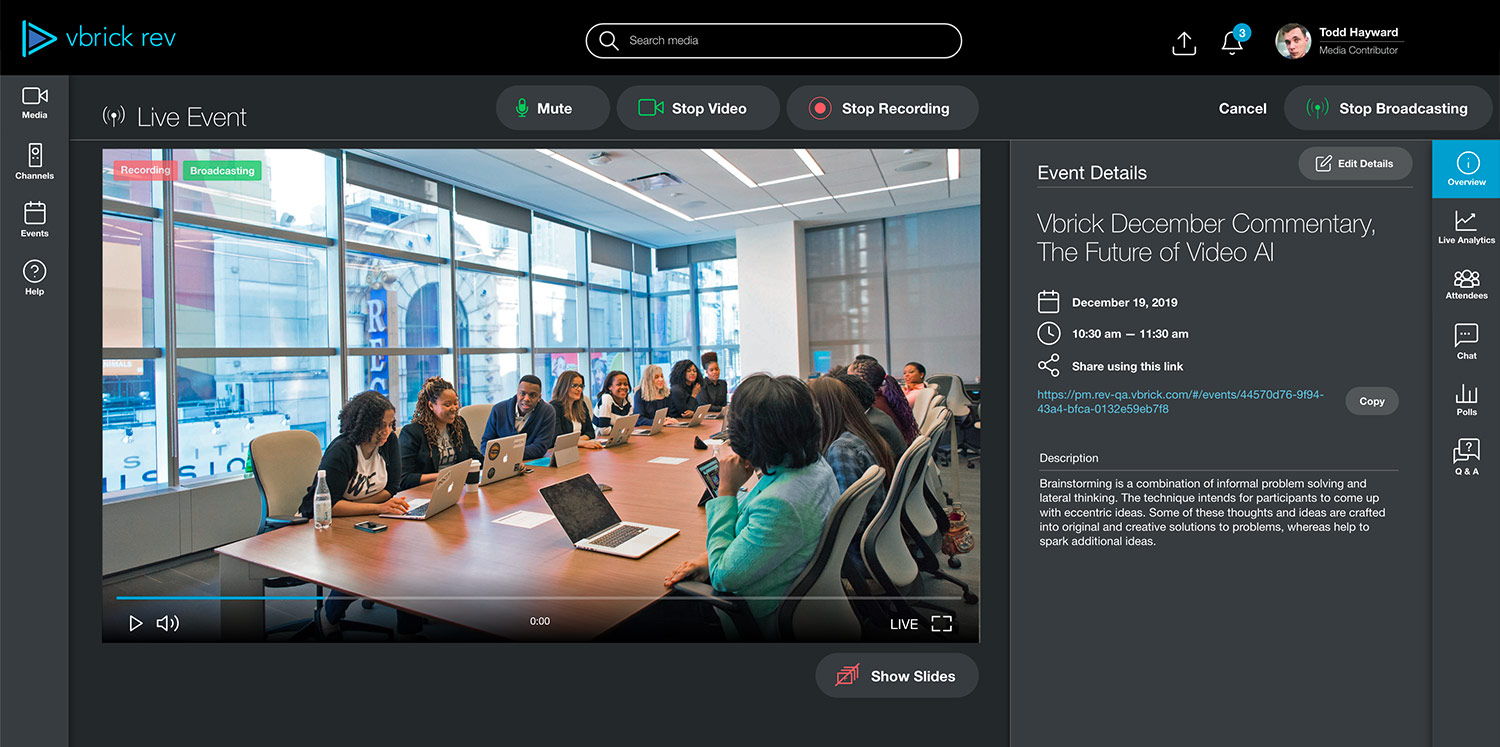
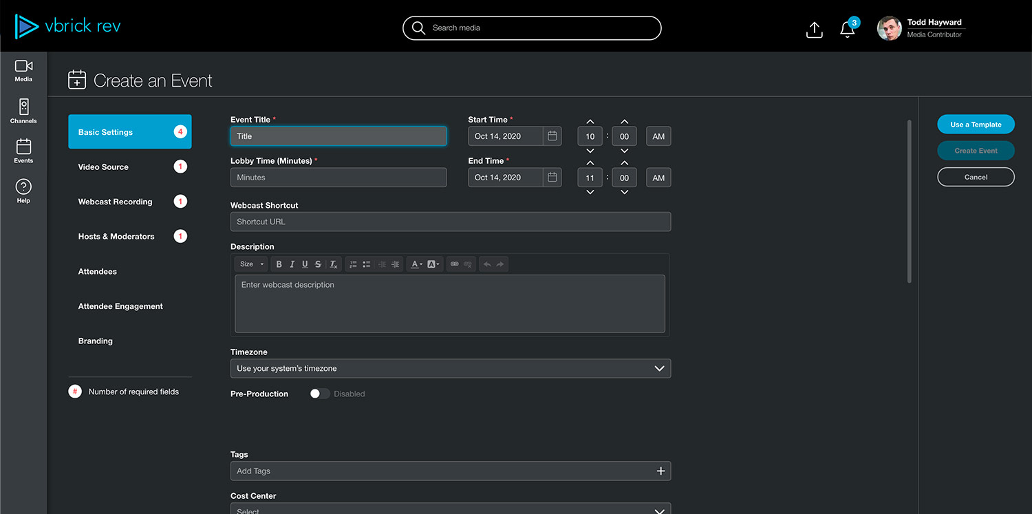
Home
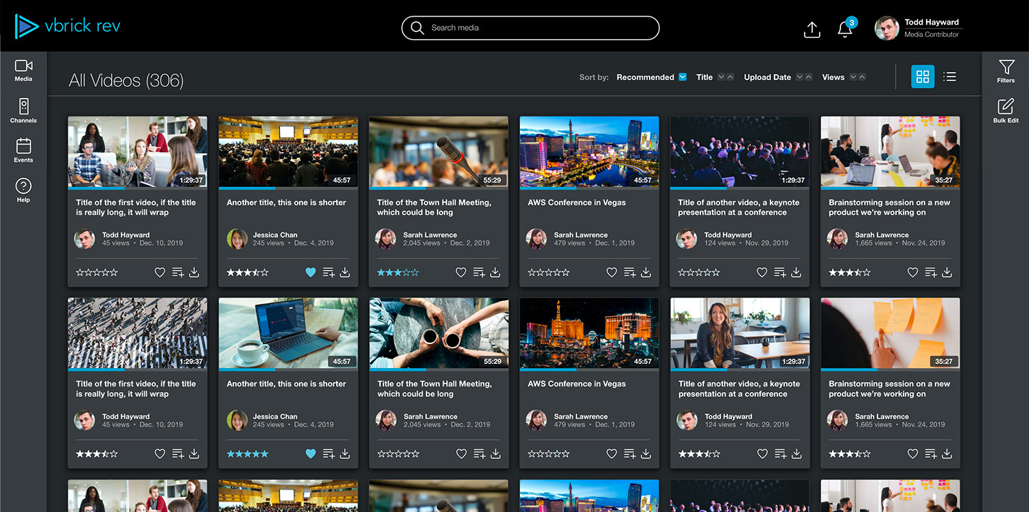
Media
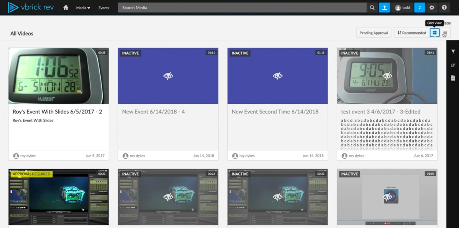
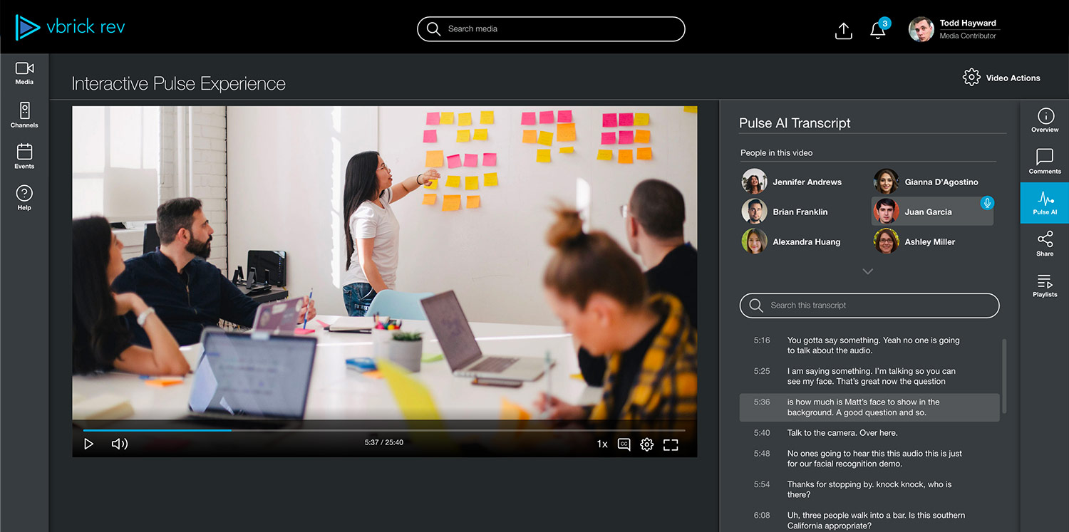
VOD
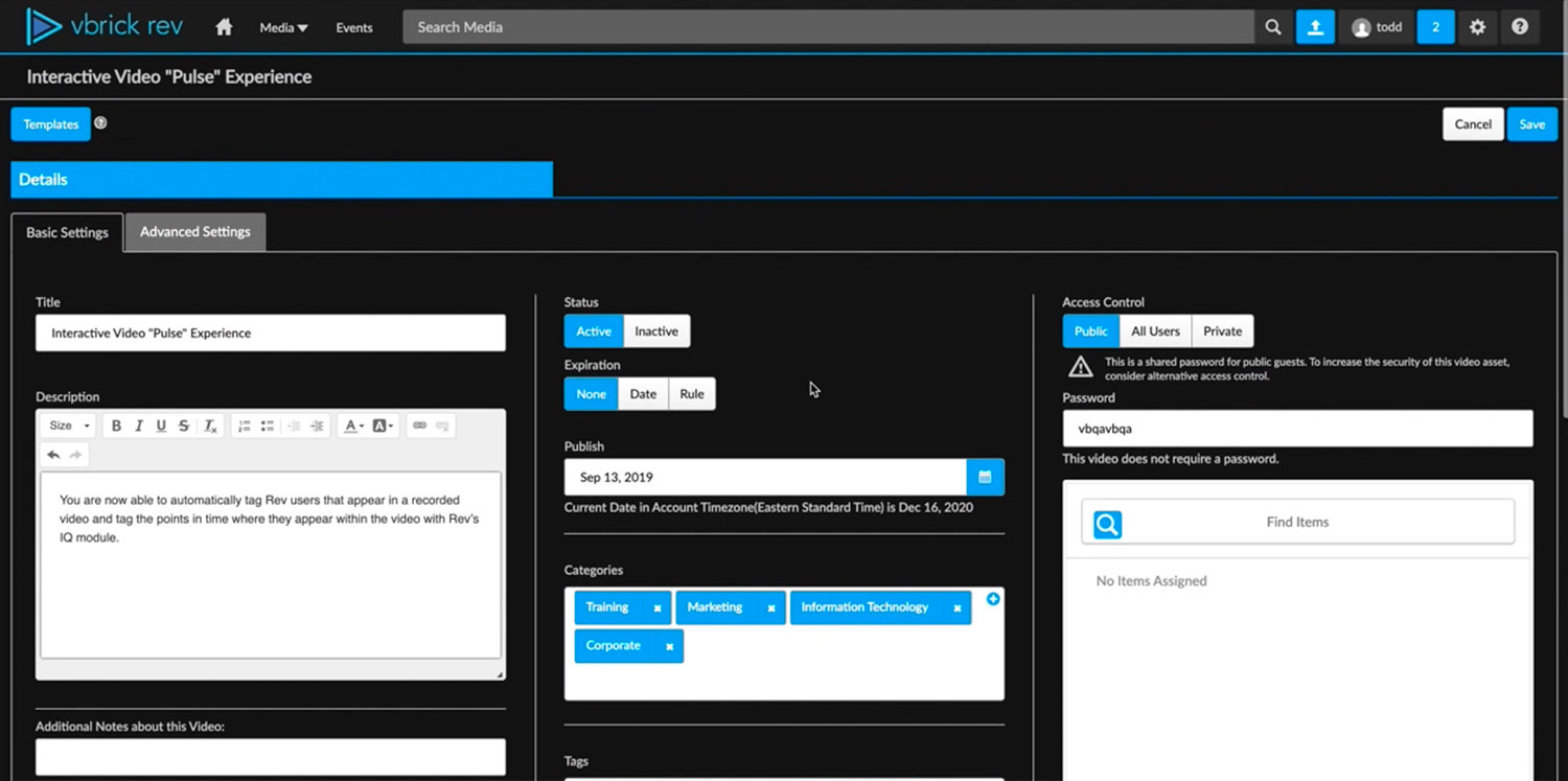
VOD Settings
Webcast
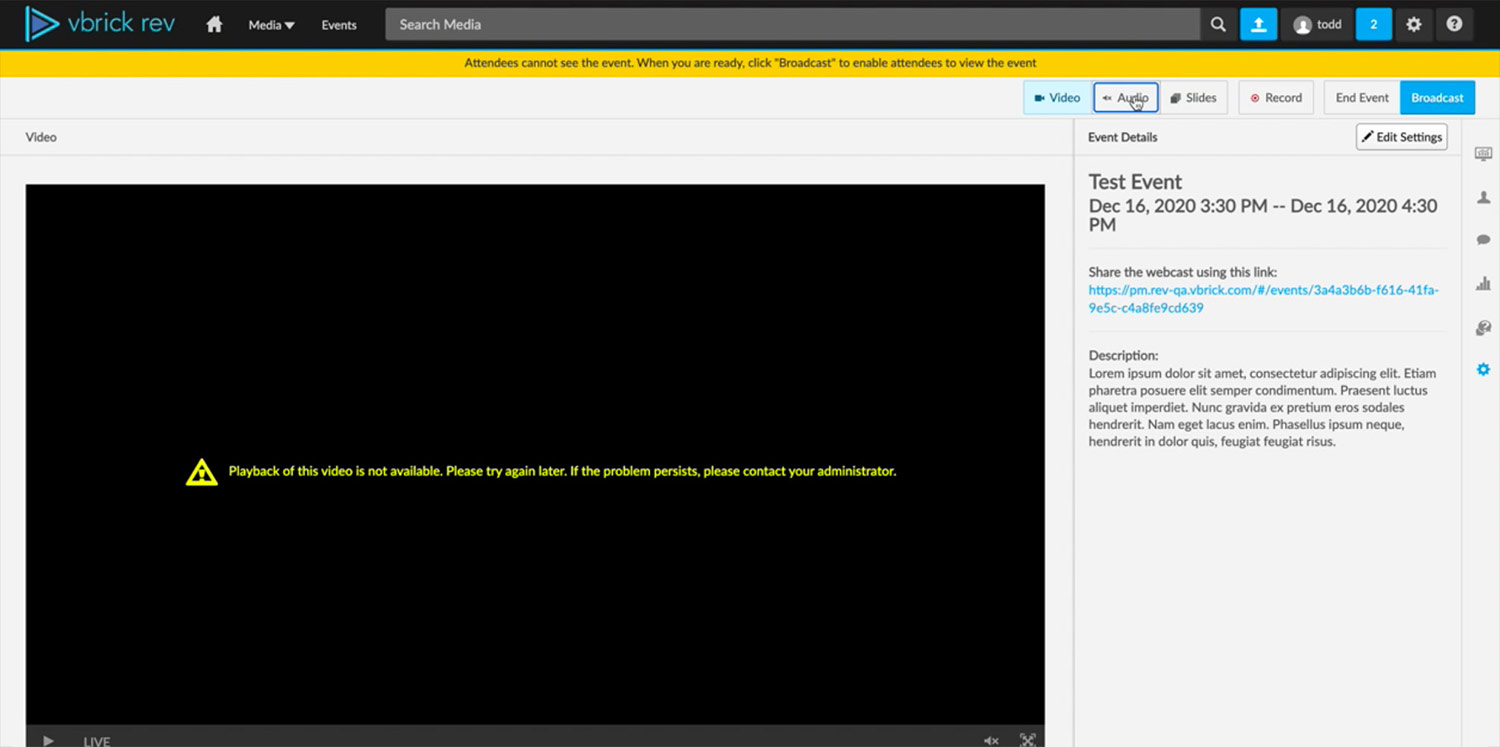
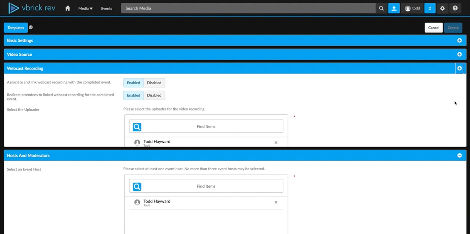
Webcast Settings
Uncovering the problems
A. What are the frustrations?
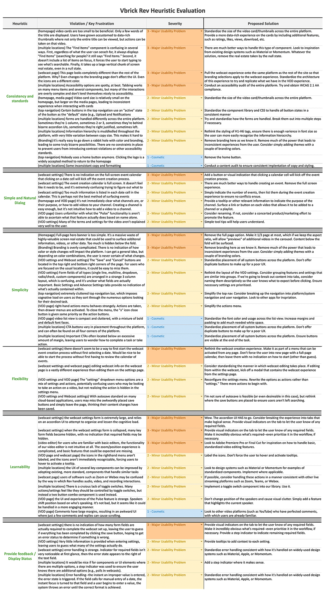
Many of the platform's frustrations were already well known, but not all were documented. I performed a heuristic evaluation against several key heuristics from Shneiderman, Norman, Nielsen, and Molich, that I felt would best uncover the nature and severity of the UI and experience violations.
Heuristic Evaluation
For this particular evaluation, I focused on six key heuristics that would address many of the high-level issues we were looking to solve for. We wanted to focus our efforts on modifications that would provide the greatest return on investment...
B. How do they affect users?
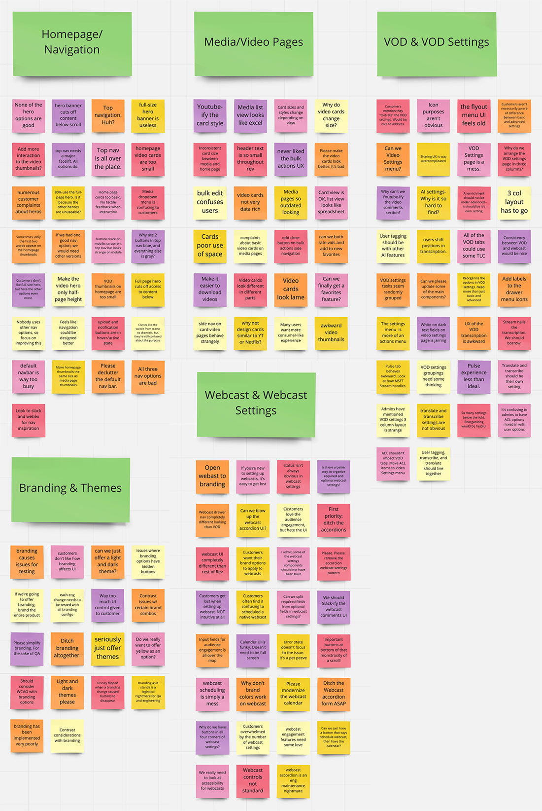
I also wanted to uncover additional insights about the platform from a human perspective. What are our clients saying? What would product and engineering like to do different? I called for an affinity mapping session to find out what colleagues really thought of our Rev Platform.
Affinity Mapping
A cross-functional representation of company stakeholders were chosen to participate in this session, with members of product, engineering, sales engineering, customer experience, and marketing eager to help out....
With a better understanding of our platform's user experience, I turned to exploring some of the design ideas I had formulated during my evaluation. In essence, our goal was to make it look better, improve the user experience — but don't blow it up. While I was given a great deal of freedom throughout this process, two guiding principles were provided: "content is king" and "keep back-end mods to a minimum"
Design Ideas
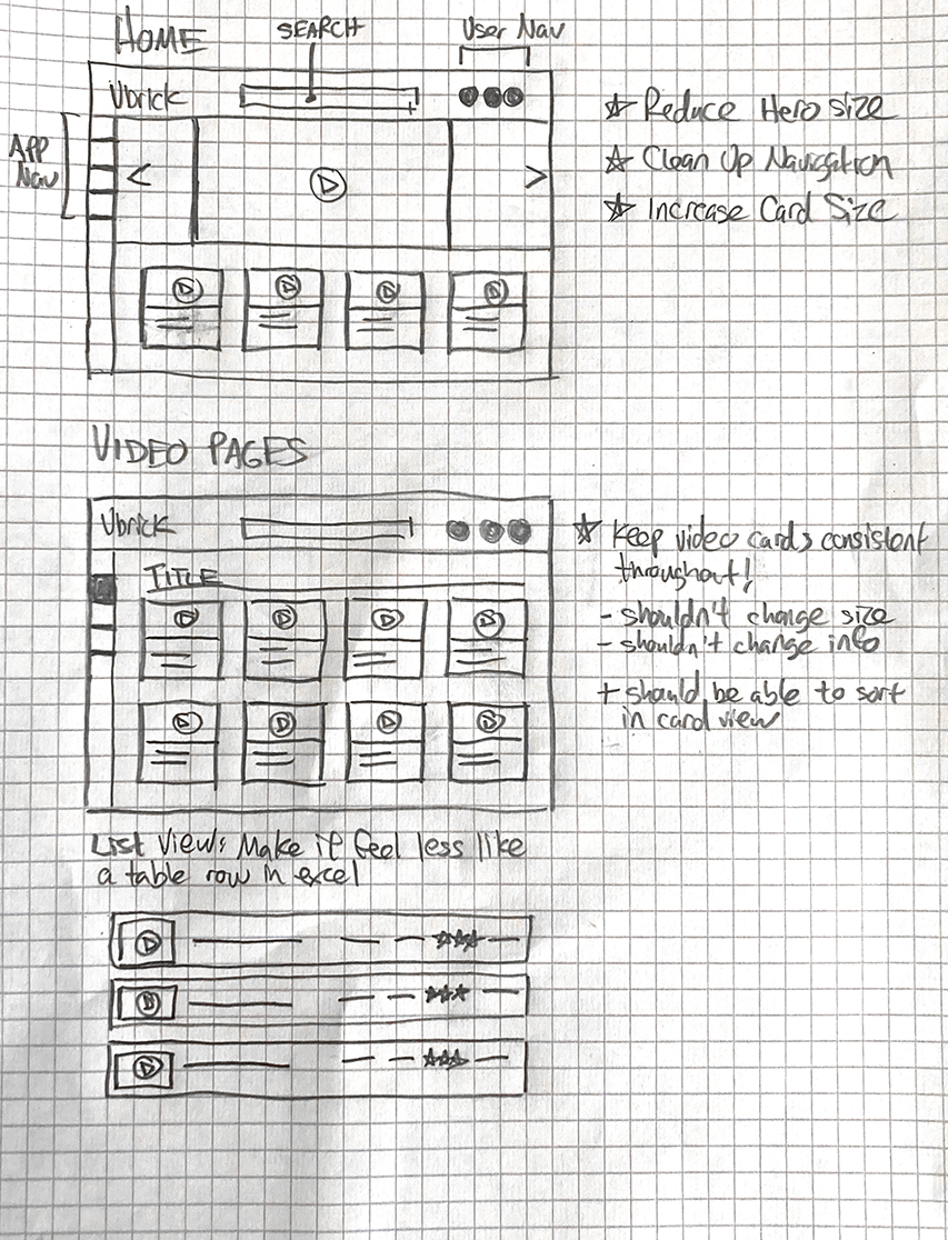
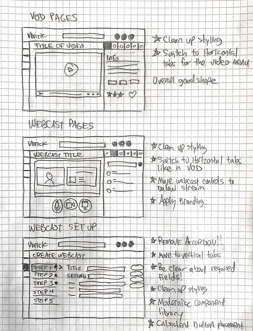
Incorporating some intelligent borrowing from Webex, YouTube, and Slack, as well as addressing several of the primary trends uncovered during my research, I sketched out some preliminary ideas to try and solve many of the high level frustrations. These intial sketches not only served to quickly get my ideas in front of product leadership, they provided me with a rough framework as I began to design the high fidelity prototypes in Adobe XD.
Iteration & Evolution
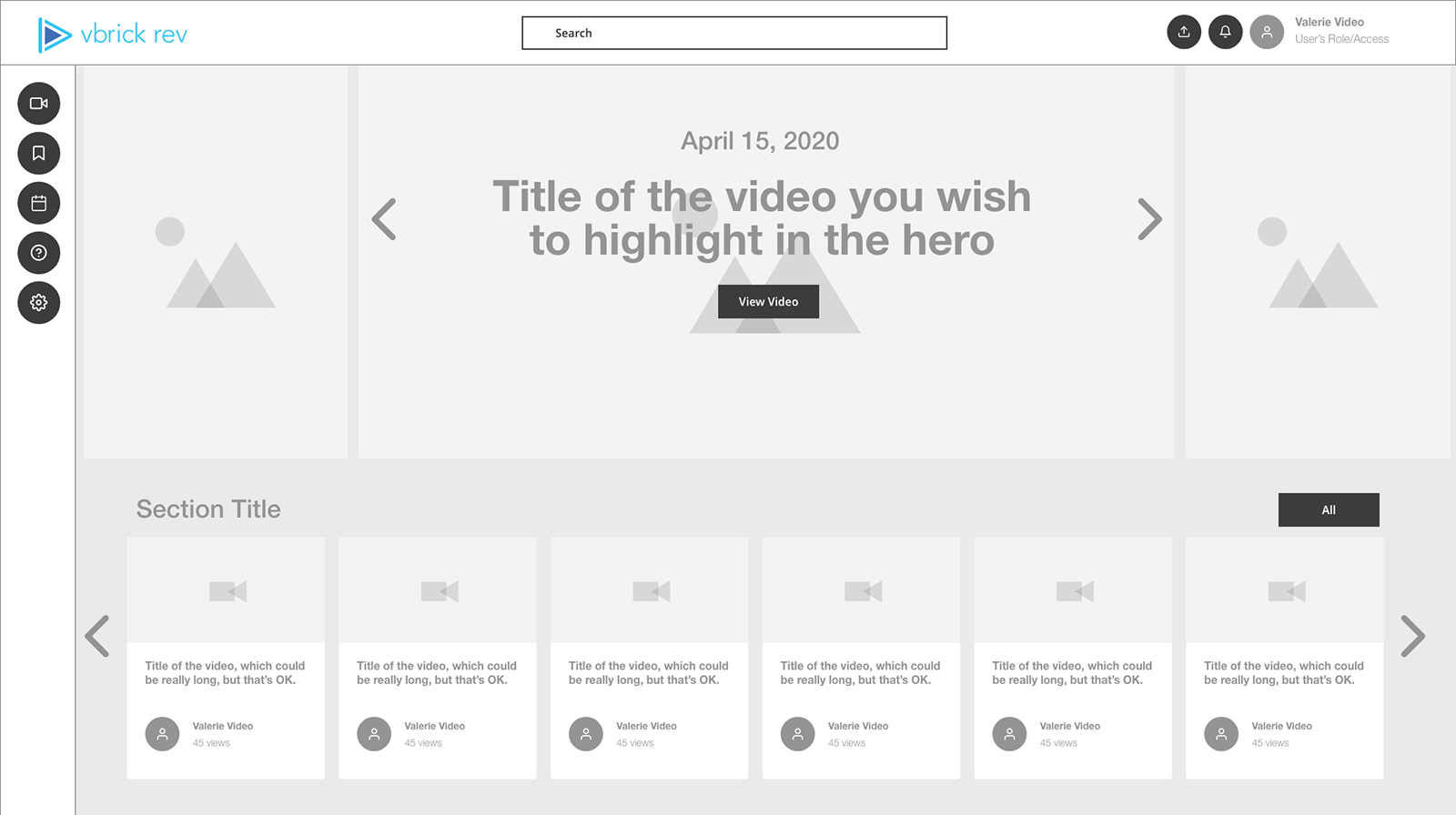
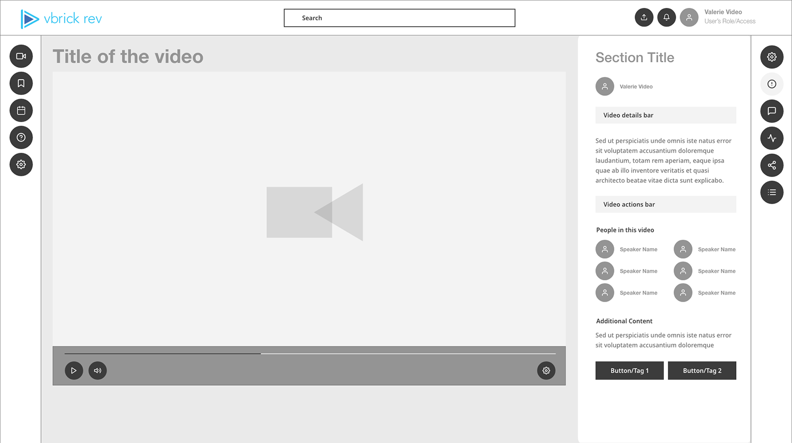
I developed wireframes for several of the key experiences, based on trends gleaned from both the research and evaluation sessions, to quickly solicit input from key stakeholders. I also developed a component library to ensure consistent prototypes and rapid development. The wireframes were iterated upon, and the designs evolved into what I've showcased below.
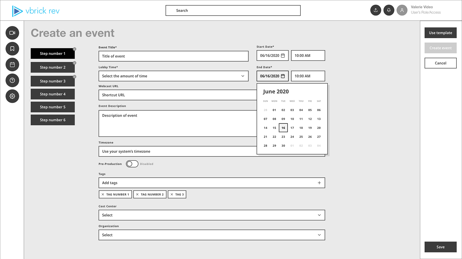
Wireframes
Home
VOD
Webcast Settings
Evolution and Enrichment of the Video Card
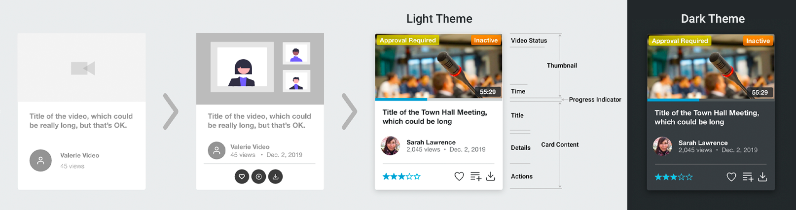
Themes
Light theme
Dark theme
The Approach
Prototype interactivity was key. We needed to be able to showcase how the UI and user experience could evolve and improve when interacting with key features on our platform. In order to generate excitement, it needed to feel real. I focused on the five to six key areas of our platform uncoverd during my research and evaluation.
Check out the before and after screens of several of the primary platform views below, as well as a demo video that shows many of the key interactions.
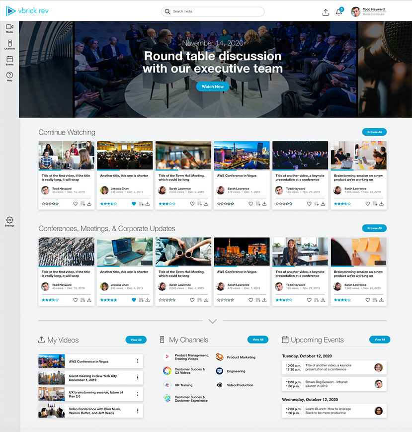
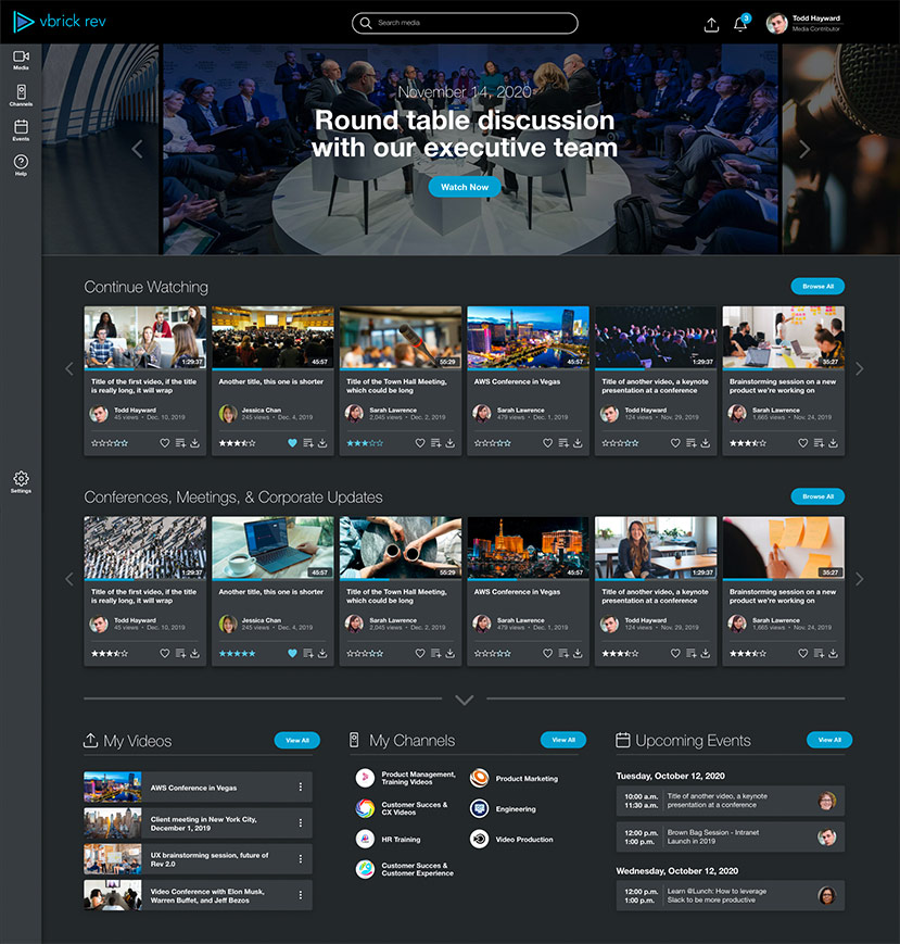
|After
Home
Media
VOD
VOD Settings
Webcast
Webcast Settings
Quick demo of the interactive prototype...
A more granular look...
While the screens and demo video above do a great job at showcasing the high-level UI improvements, I dove a bit deeper. Using data and insights synthesized from both the heuristic evaluation and affinity map, I formed an actionable list of key frustrations from throughout the platfrom and a corresponding set of proposed solutions, which I've outlined below.
If you have the time, let's walk through how these frustrations impacted users and take a look at how I solved for them. I've included before and after walkthrough videos to compare and contrast the updates.
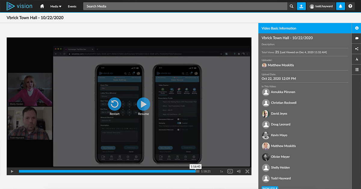
The demo day had arrived, and I unveiled the prototypes at our October Town Hall. Very few collegues outside of the product team, CEO, and the VP of engineering had seen the concepts. The purpose of doing the demo in such a setting was to reach our entire local, national, and international staff in a state at which they would be engaged. The demo was a success, with many of the Sales, SEs, and CX team voicing approval in the live chat and in follow-up emails to the both the executive team and product team.
Fresh off the success of the demo, I began charting the next phase of the project. While the prototypes were conceptual in nature, they did represent a potential vision for what the Rev platform could become. The challenges now were as follows...
Product Roadmap
With the demo a success, and leadership's desire to reinvigorate the platform, the challenge was to get the Rev 2.0 on the product roadmap for 2021. There were a number of massive architectural and integration features planned, so obtaining engineering and QA resources was key to success.
300-450 points in 2021
Rev 2.0 was officially added to the product roadmap for 2021. Point allocation came in at a respectable 50-75 points per release, which should be enough to make good progress in 2021.
Engineering
I set up a series of ongoing meetings with the engineering, product, and QA teams to discuss the optimal ways in which to divide and phase the workload. Each meeting focused on a key section of the platform, potential technical challenges, impact value, and other factors that would determine direction.
Dedicated resources
Engineering was receptive to the design recommendations, and we received dedicated engineering resources devoted to working on front-end enhancements associated with Rev 2.0.
User Feedback
I scheduled meetings with key internal stakeholders, such as our sales team, sales engineers, and CX team to discuss feature priorities and customer impact. We also met with seven of our power users, and several of their most engaged end-users, to gather initial feedback on the prototypes.
Excitement & Optimism
Discussions were productive, and all parties were excited for what the future held. Several common themes emerged from these talks, which helped inform which enhancements to tackle first.