Simplifying the Off-Campus Housing Search and Leasing Process
Summary
An app concept for a white-labled off-campus housing platform geared towards univesrity students and property owners in college towns. It was created using two full iterations of the user-centered design process in an academic setting. The app explores three primary user flows (with one being discussed in this case study) that would be covered by using this app: student-looking for roommates, student-looking for housing, and property owner-listing housing for rent.
Problem Statement
University students and property owners have limited options for leveraging property leasing and roommate matching technology platforms that cater to a university population concentrated within a specific geographic area. Both parties often utilize a combination of various websites, apps, or classifieds to find, list, lease, and pay throughout the rental process. Students care deeply about roommate compatibility, security, and piece of mind, but existing solutions often fall short. Property owners care about leasing, marketing, and timely payments, but existing solutions either do one thing well or 10 things poorly.
Project Goals
- Develop a proof of concept for a university-centric roommate and housing finding app that could be white labeled by universities.
- Conduct a variety of reserach, including user surveys and interviews, to gain insights about current behavior when searching for, or listing, properties to rent.
- Design, evaluate, iterate, and validate our design decisions through a combination of non-user and user evaluations.
- Finalize the design (note: for this case study, we'll only be exploring the "Property Owner" user path).
We wanted to first investigate existing solutions that could be used to address our problem statement. There are numerous apartment, roommate and property leasing web and mobile portals available to potential lessors and lessees. Several of the existing solutions are purely property rental services and some are simply roommate finders. While there are options that offer a hybrid solution — combining the ability to search for available properties and locate a potential roommate — many of the options featured dated user experiences, and very few were designed exclusively for university students.
Comparative Analysis
Realtors

Pros: Familiar with housing supply, personalized service, offer integration with property management
Cons: Often a limited supply of options, only those who choose to list with them, most do not offer "looking for roommate" functionality
Classifieds

Pros: Familiar to most, easy to use, offer "looking for roommate" functionality
Cons: Questionable security features, never know what you'll get, dated user interface
Websites

Pros: Intuitive interface, wide adoption, also offers easy-to-use native app
Cons: Mix of university students and locals, no option for property owners to list housing
Mobile Apps

Pros: Wide adoption, reputable app, "looking for roomate" functionality prioritized
Cons: City-centric, university towns vastly underserved, no options for property owners to list housing
University-Centric
Pros: University-centric functionality, several large college towns represented
Cons: Clunky interfaces, web-first layouts, favor large apartment complexes (pay-to-play), lacking robust "looking for roommate" functionality
Our Target Users
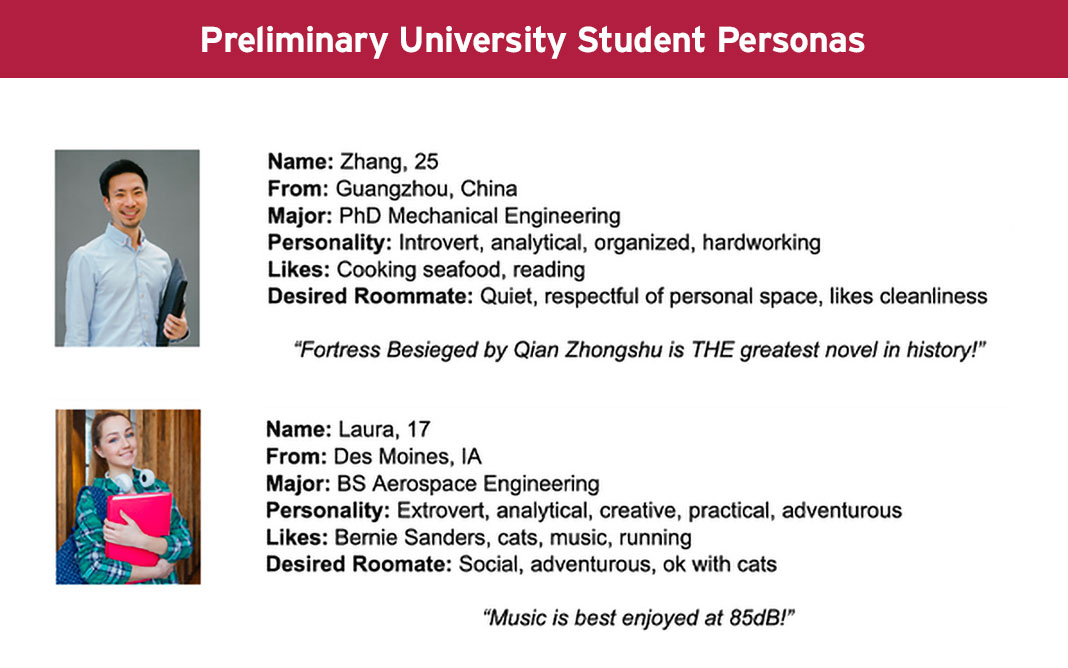
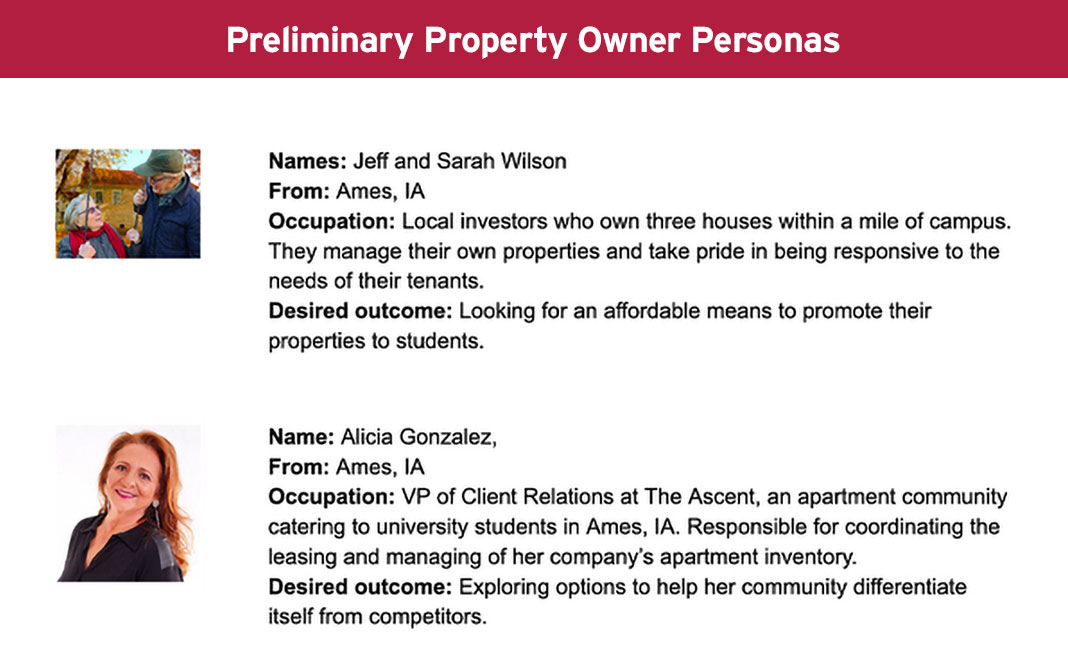
As part of our preliminary research, we identified two primary user groups that would be most likely to utilize our app. We developed preliminary personas which will be further refined as we iterate through the design process. These core users consist of:
- University students looking to move into off-campus housing or find roommates with compatible lifestyles and property owners.
- Property managers looking to lease their houses, townhouses, or apartments in university towns or cities.
Our Proposed Solution
A scaleable, mobile-first housing and roommate matching platform that could be white-labeled, and sponsored, by universities. For students, the platform would feature a robust suite of ethical and non-discrimantory lifestyle and neighborhood filters. For property owners, the platform would feature a streamlined listing process, online application and leasing functionality, and integration with Paypal and Venmo. Secure and private in-app messaging will streamline communication between potential roommates and landlords.
1. User Surveys
To validate the problem, we wanted to reach as many people as possible. To do so, we created two surveys using Google Forms and sent them to two unique respondent groups: current college students and current property owners. We received a total of nine responses. The purpose of the surveys was twofold:
- To understand how college students go about finding a roommate and housing.
- To understand how property owners list their property, communicate with tenants when there is an issue, and how they maintain the communication for rent payments and lease updates.
2. User Interviews
To further develop our understanding of the problem, we interviewed 3 potential users of the app:
- First-year graduate student
- Undergraduate student (currently a junior)
- Property owner & current landlord

Interpreting the Results
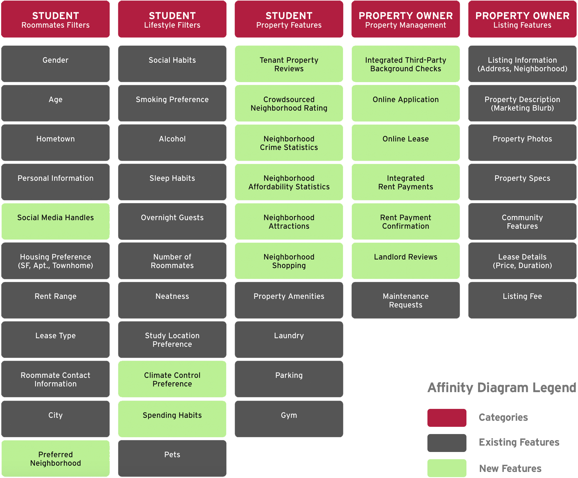
The surveys and interviews yielded valuable observations into the desires and motivations of both the university students and property owneres. Results of the survey were compiled and analyzed to gain insight into several areas of interest that will serve to shape our decision-making process. A key discovery was made with regards to an existing solution, which caused a slight pivot in our strategy. Insights gained from the user surveys and interviews were analyzed for themes and patterns, which were organized into an affinity diagram to help drive feature design and provide additional data for the formation of our user personas.
University Students
- Appreciate custom search filters, such as price range, distance from campus, and housing specs.
- Care deeply about roommate compatibility, and prefer one with similar lifestyles.
- Privacy, safety, and security are important factors when searching for roommates.
- Students who have not utilized an app or website before are open to use one.
- Students primarily use apps or websites to search for housing more than roommates.
- Students would feel more comfortable with a housing platform endorsed by their school.
Property Owners
- Existing solutions are somewhat satisfactory, suggesting room for improvement.
- Would like to see more data on performance of online rental listings.
- Half prefer payment via check while half would be open to online payments.
- Property owners who utilize property managers prefer to stay out of communication loop unless there's an emergency.
- If managing rental properties on their own, property owners are open to an all-in-one solution.
- If rental properties are not nearby, finding reliable property managers are a priority.
Key Discovery!
In both our survey results and in our interview discussions with university students, we discovered that an existing solution, similar to what we proposed, already existed.
Off Campus Partners offers a white-labeled roommate and housing finding platform at several universities nationwide. We were able to secure temporary access to the platform and determine that a more viable solution would be to modify and expand upon the features offered by the existing Off Campus Partners platform.
Affinity Diagram
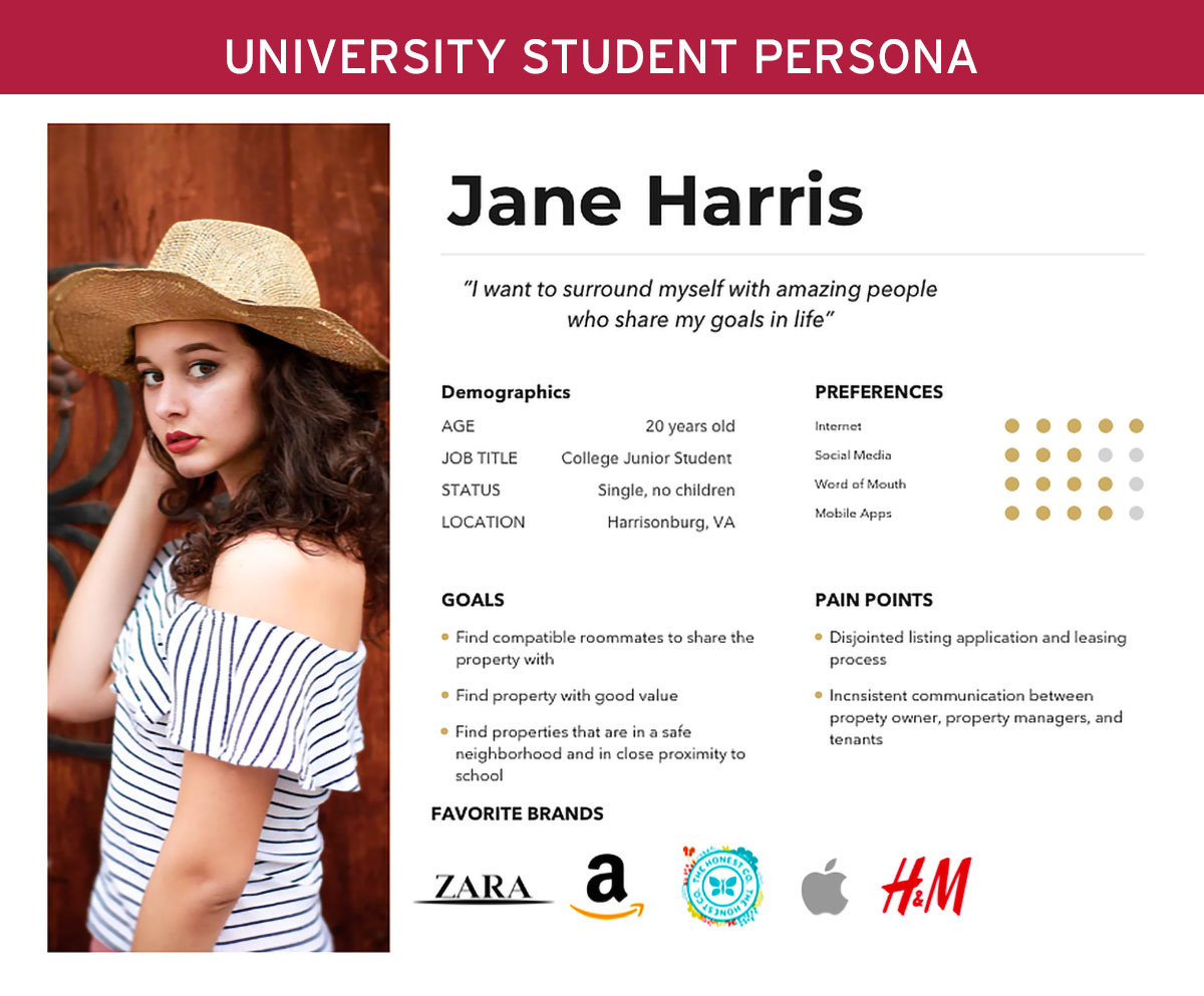
University Students
- Wide range from college freshman students to graduate students (18+ yrs old)
- Tech savvy
- Looking for roommates that are compatible
- Looking for housing at a decent rental rate and in good neighborhood
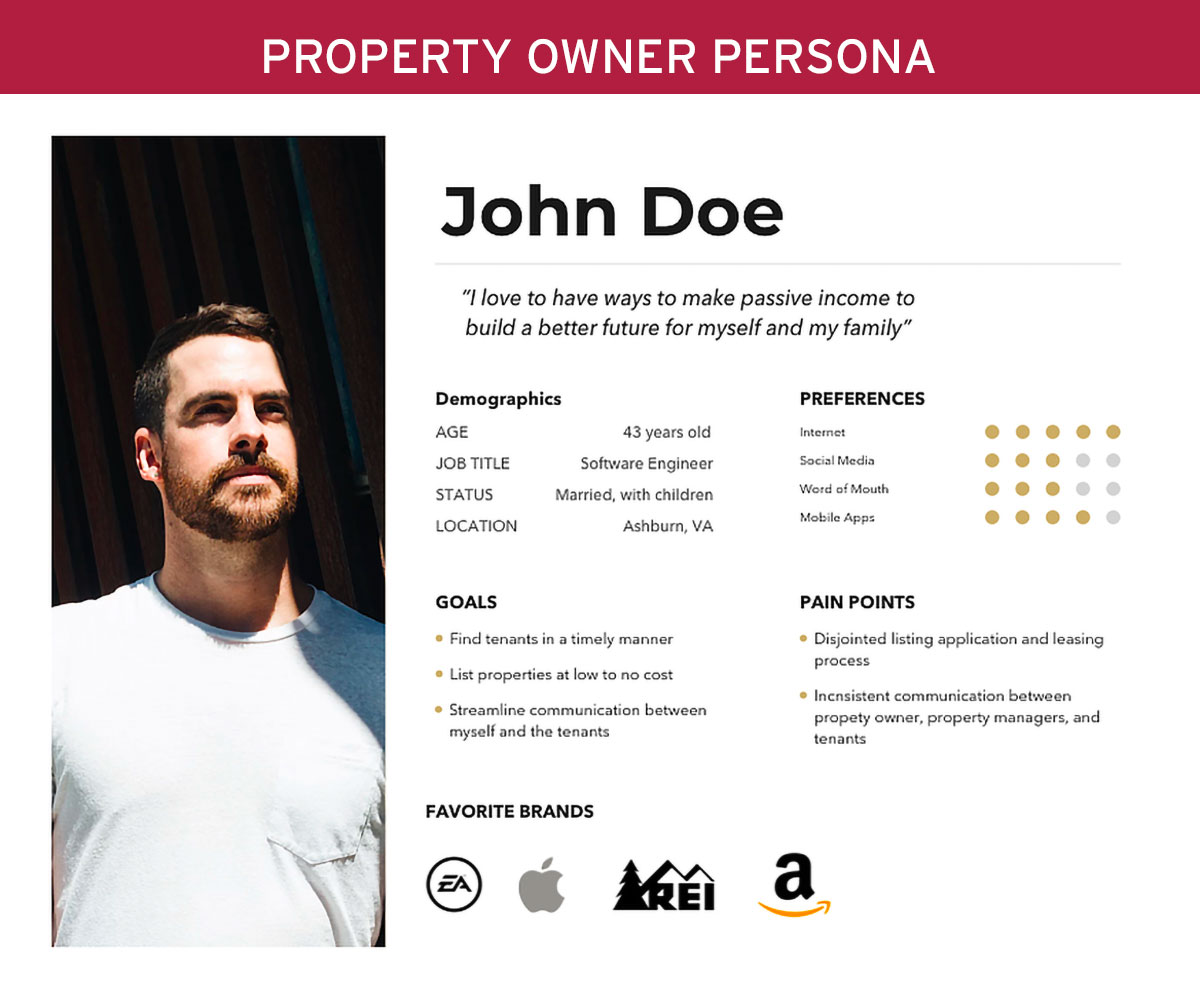
Property Owners
- Property owners who own properties in college towns or in close proximity to college towns ( 30+ yrs old)
- Looking to make a passive income
- Find tenants with least amount of fees
- Desire to keep tenants as long as possible, and find ways to market themselves
With research complete and insights to draw from, we set out to develop wireframe prototypes for each of the three user primary user flows:
- Students looking for roommates
- Students looking for housing
- Property owners listing their housing
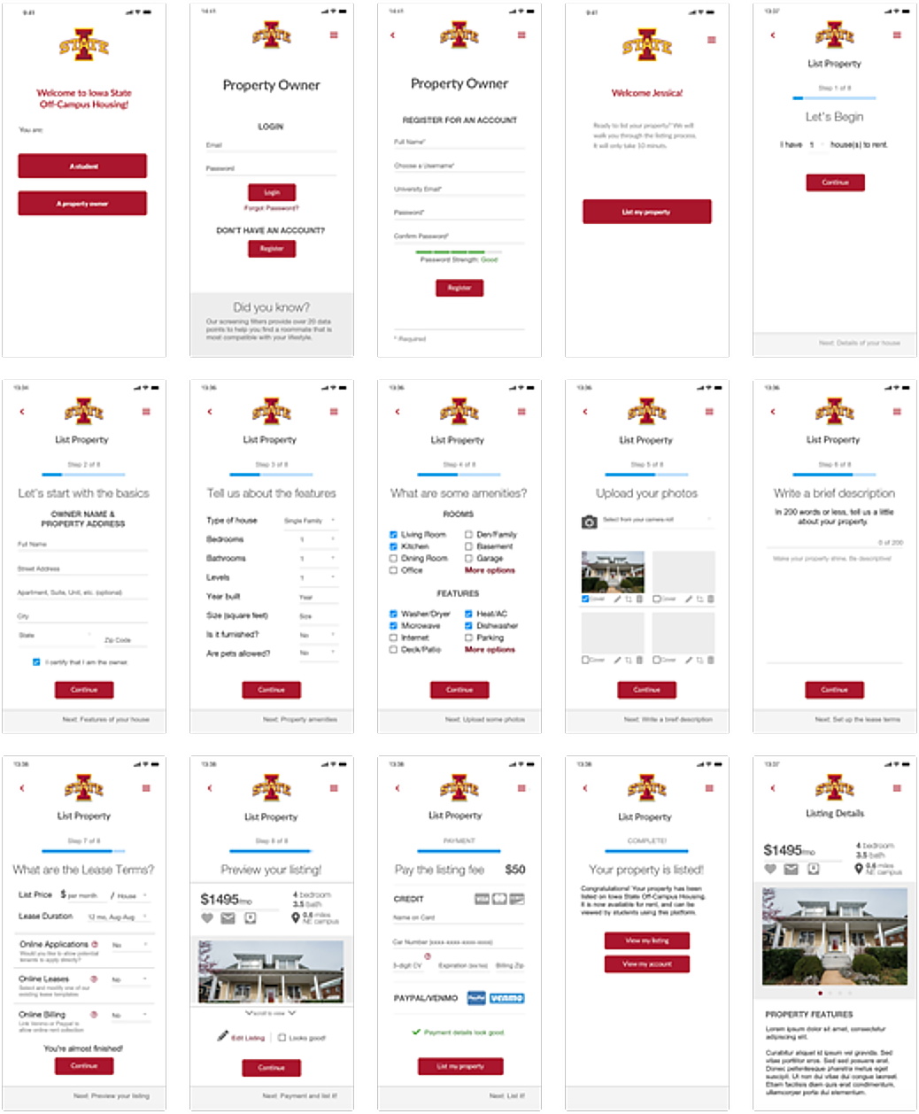
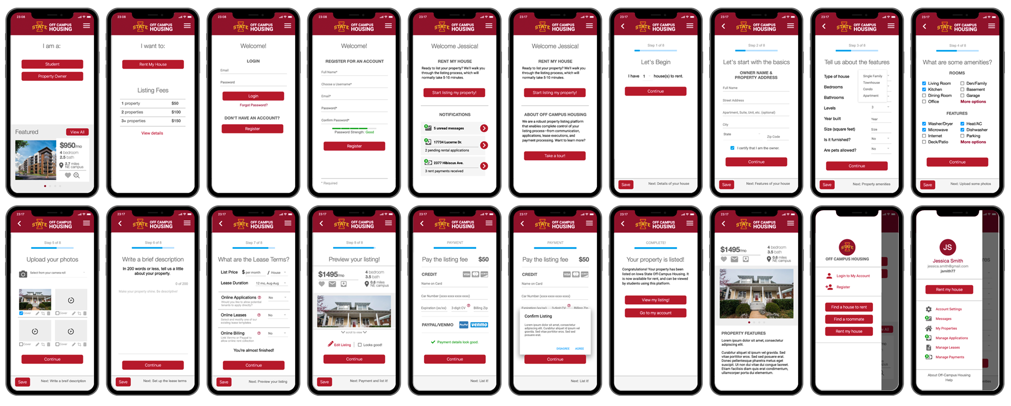
For the purposes of this case study, I'm going to focus on the "Property Owner" user flow. Key enhancements include a clean mobile-first design, a step-based listing experience, online application and leasing, and integrated rent payments.
Key Design Features Across the App
- Clean, ad-free, mobile-first design
- White-labled architecture and branding
- More robust, ethical, and non-discriminatory lifestyle filters
- Neighborhood "convenience" scores and ratings
- Neighborhood crime statistics
- Crowdsourced neighborhood ratings
- Tenant property and landlord reviews
- Integrated online application and leasing options
- Integrated rent payments via Paypal or Venmo
Property Owner User Flow
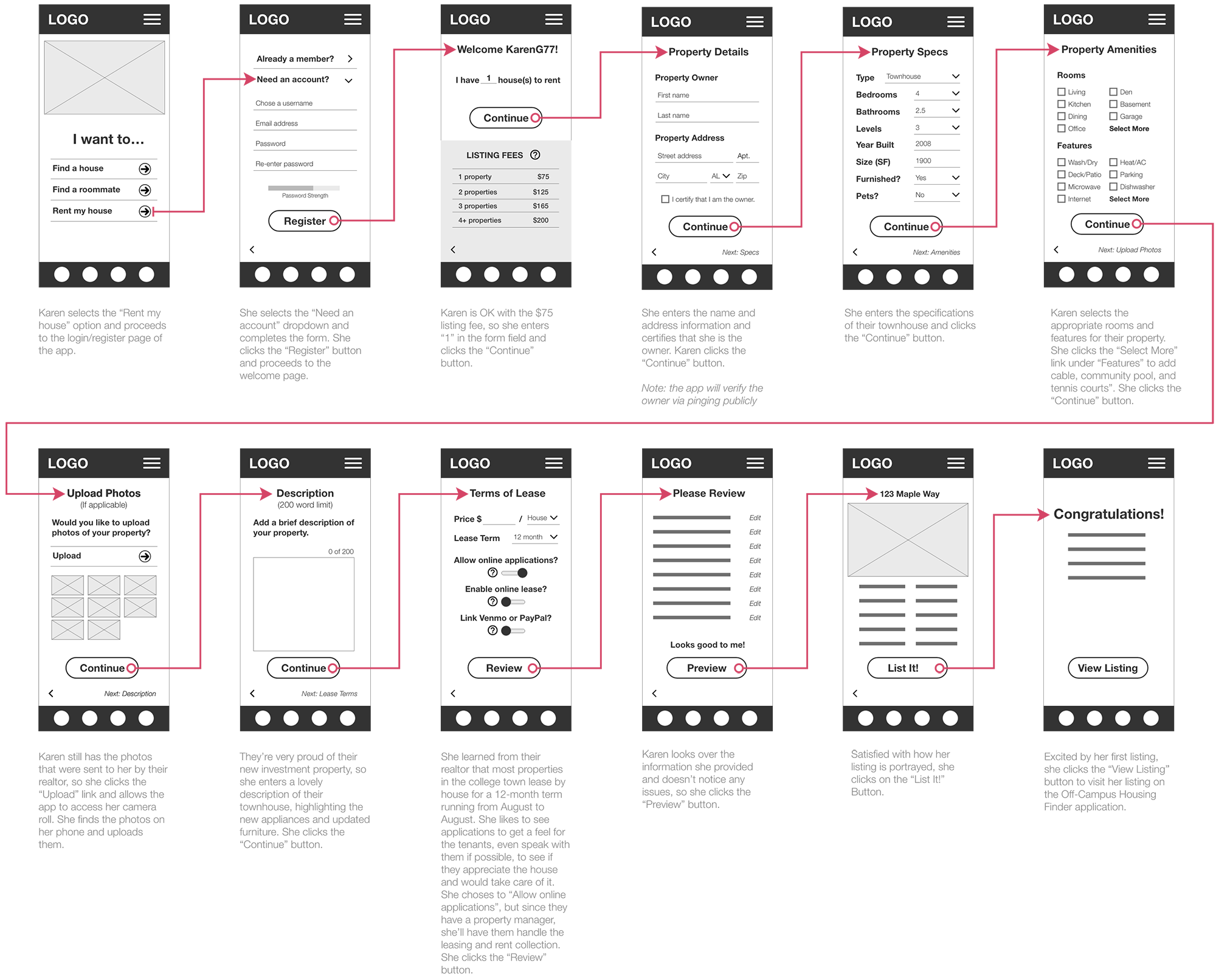
To uncover any potential usability issues that may effect task completion, we leveraged a heuristic evaluation by enlisting a group of outside usability experts. We utilized an assortment of heuristics from Shneiderman, Norman, and Nielsen & Molich, to evaluate our wireframes — heuristics we felt had the greatest impact on the success of our project. The team was comprised of four evaluators who individually analyzed the prototypes to determine if there were any design issues present.
Heuristic Principles
- Be consistent
Sample: Is visual design consistent across each task screen? - Speak the user's language
Sample: Is simple terminology used that a beginner can understand? - Simple and natural dialog
Sample: Is there too much information that might overwhelm a user? - Simplicity
Sample: Is there an appropriate amount of white space? - Flexibility
Sample: Can they edit information that the user has previously chosen? - Show Status
Sample: Do they know when they have completed a task? - Learnability
Sample: Can users figure out how to use the interface without help? - Prevent Errors and Support Error Recovery
Sample: Are form errors either prevented or is it clear what error has occurred if they try to submit something incorrectly during a task?
Results of the Evaluation, with Proposed Solutions
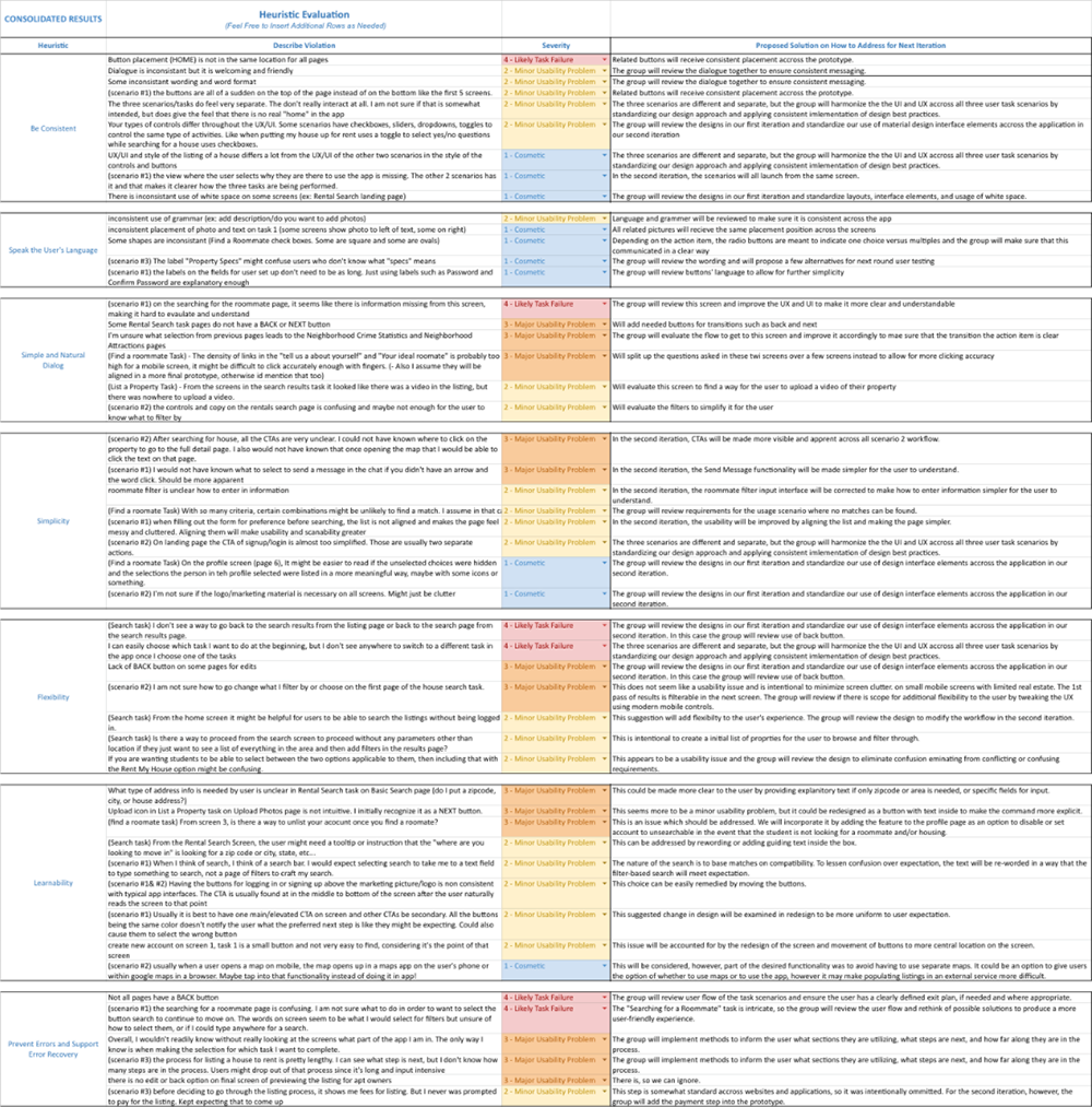
1 - Cosmetic
2 - Minor Usability Problem
3 - Major Usability Problem
1 - Likely Task Failure
Upon completion of the evaluation, our team met to review and compile the recommendations to see where we fell short. We distilled the issues into six general categories that needed our attention. While the "Property Owner" user flow was in fairly good shape, there were a few items that needed addressed. As we modified our design per the recommendations from the evaluation, we also implemented functional prototypes that could tested with our users.
Identification of Issues
- Inconsistent design treatments with regards to the overall user experience
- Inconsistent implementation of user interface elements across the application
- Inconsistent placement of navigation within the three user task scenarios
- Missing or ineffective methods for providing user feedback or status
- Missing or ineffective methods for performing necessary tasks within the application
- Inconsistent verbiage and instructions
Key Modifications for "Property Owner" User Path
- Move placement of back arrow to more natural location
- More descriptive task titles
- Implementation of a step counter
- Implementation of a consistent UI design kit
- Addition of listing fee payment screen
After completing our design update and building our functional prototypes, we turned our attention to developing a research plan that could help us to determine the success (or failure) of our UI/UX improvements. We developed our hypothesis and selected several dependent variables (and their metrics) that would yield both qualitative and quantitative data which could be used in our summative assessment.
| Dependent Variables | Metric | Data Type | Collection Method |
|---|---|---|---|
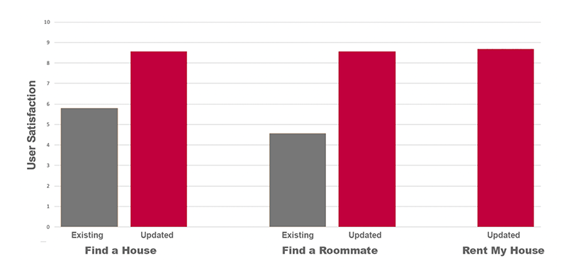
| User Satisfaction | Numeric Score | Likert Scale 1-5 | Questionnaire |
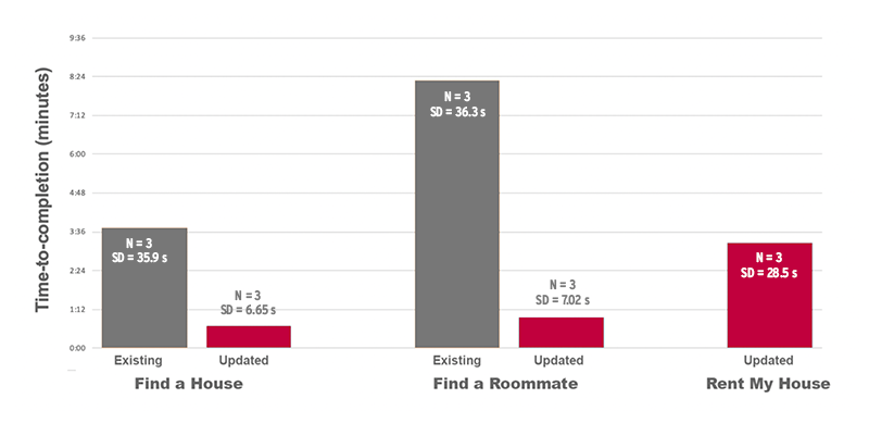
| Performance | Time to Completion | Seconds | Stopwatch |
| Usability | System Usability Score | Numeric Score/100 | 10-Question Survey |
| Qualitative Analysis | Quantitative Analysis | |
|---|---|---|
| Qualitative Data |
• User Satisfaction Survey • Observation |
• System Usability Survey |
| Quantitative Data | • Location of Errors |
• System Usability Score • Completion Time • Number of Errors |
Quick Demo Video of the "Property Owner" Path
We utilized a within-subject experiment design where users would evaluate a task for each of the three primary user paths for both the existing Off-Campus Housing Partners website (branded as William & Mary) and our updated Off-Campus Housing prototype (branded as Iowa State). Since our design update utilized a mobile-first approach, the evaluations were conducted in a mobile state. We utilized three university students in the testing of the two student user paths, and three property owners in the testing of the property owner user path.
User Satisfaction
Time to Completion
System Usability Score
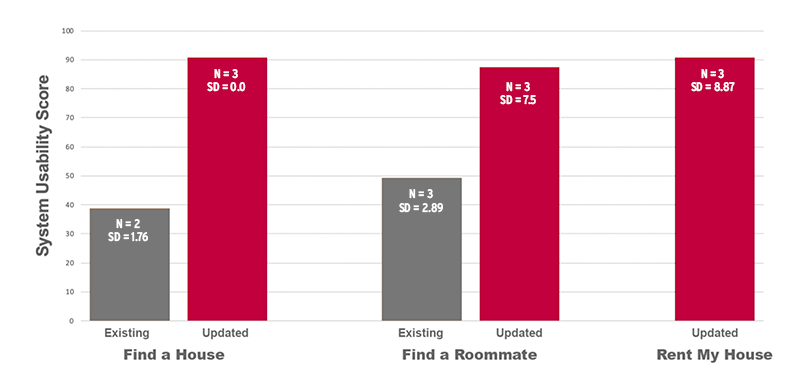
We performed a statistical analysis on our results, and while the quick time-to-completion scores were probably due to the fact that users were evaluating prototypes versus a functional website, the results were found to be statistically significant.
Not only did the user testing validate our design decisions for the three user paths we explored, it provided some additional feature requests that weren't discovered during the non-user (heuristic) evaluations. We added the ability to save your progress, notifications for messages, applications, and payments, and reduced the size of the header. While we appear to be heading in the right direction, the user evaluations also highlighted some of the many challenges we face as we continue to iterate.
This was a passion project that I was fortunate to explore while pursing my Master's in Human Computer Interaction at Iowa State. As a real estate investor for 17 years, we've bought, sold, and leased numerous houses in college towns in Virginia and North Carolina, and we've experienced all of the frustrations that come along with the territory. I've spent many hours over the years thinking of ways to simplify and enhance the process for all parties involved, and this project has allowed me to not only do that, but to refine my design philsophy, as well.
Please note: for the purposes of this project, our intent was not to provide detailed designs for every possible screen. Our goal was to provide a high-level overview of the primary user flows, featuring a streamlined mobile-first experience and many of our notable enhancements, then validate those decisions through user testing. There were several limitations, the main being time. With that being said, I hope you enjoyed reviewing this case study.